Tuesday 15 March 2011

Final Poster Design

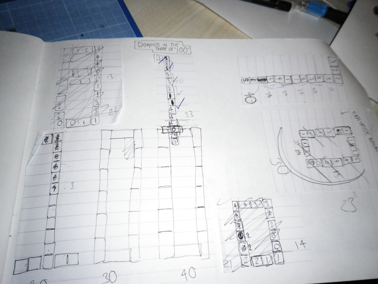
This is my final poster design for 100 years of GF Smith Paper. I think the geometric element of the dominos along with the minimalistic futura typeface give the poster a very clean, modern aesthetic. 
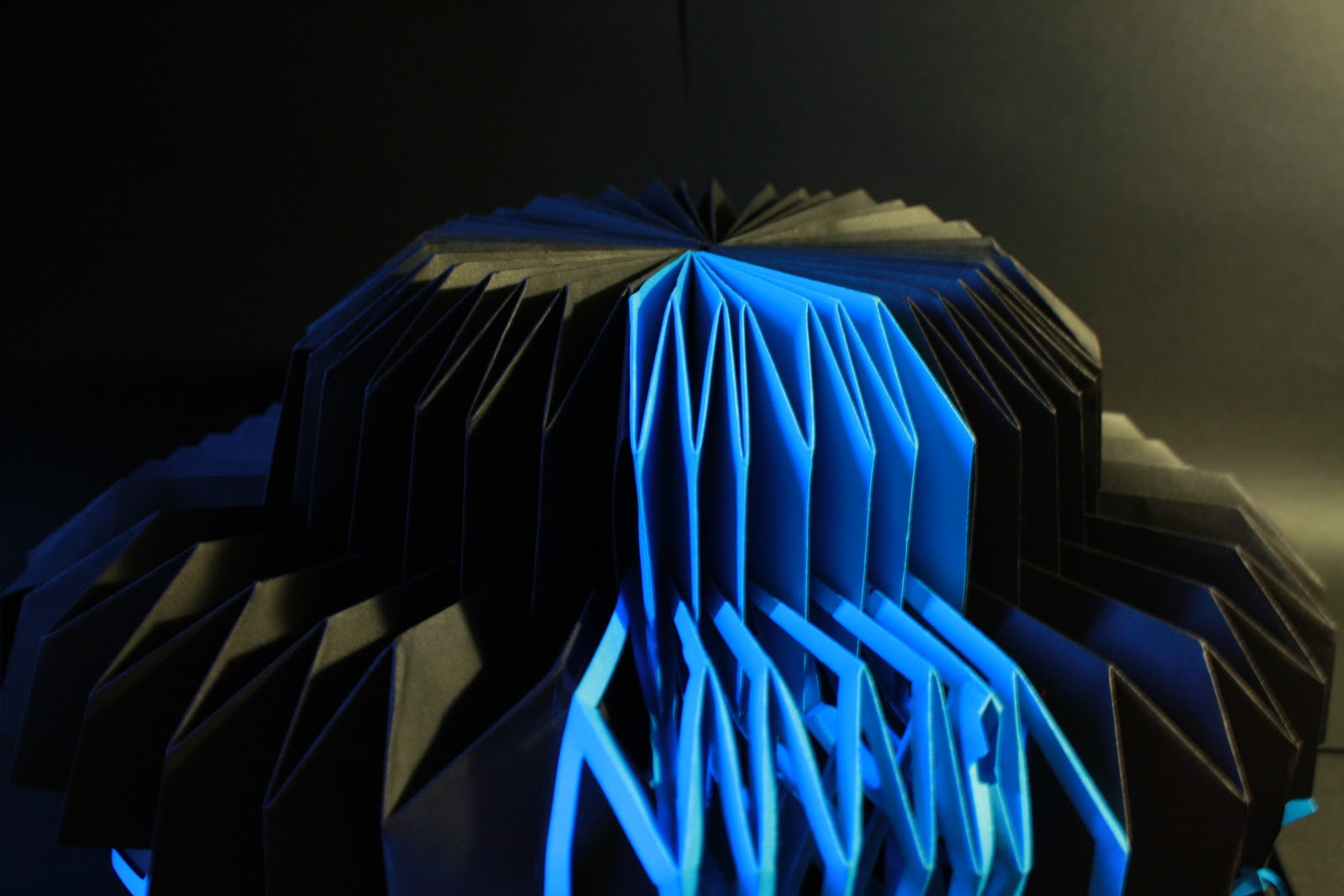
At first glance I'm not sure you can tell that the poster is made from paper but that will make people look closer and see the piece in more detail which was my aim.
I used blue paper for the background to create a link between my poster and 3d sculptural piece. 
I considered grid structure when adding the text, lining it up with the first 0 which brings structure and balance to the poster. I also think the way I have used perspective contrasts well against the regular text.

Monday 14 March 2011

Ideas for layout...

Before adding the text to the poster on photoshop I've experimented with different layouts for the handmade aspect of my work before I take the final photograph.


I have decided to use this layout because I think it makes the '100' clearest to read. I think I will place the text underneath the two '0's' to balance the piece


The Domino Effect

I have been trying to decide how to photograph the dominos. The choices being stood upright,  knocked over or laid flat on the paper.


Stood upright in a line like this is a common association with dominos and also 'the domino effect' a chain reaction where a small change causes something else near by to change. This would give the poster more depth than the other two choices but it would stop with dots being visible which defeats the point of the total adding up to 100 so I don't think it's the best choice.


I had the idea of taking the photograph with a slow shutter speed whilst the dominos are falling but again this hides the fact that the dots in total add up to 100 which was the main focus of my poster.


I have decided to go back to my original plan which was to have the dominos laid flat on the paper. The dots matching up as if a game is being played. I have also decided to photograph the poster from this kind of angle to create perspective and shadow.


making a domino x 23

I am going to construct 23 identical 3-d boxes from black card. I know that this will be very tedious but I'm going to make sure they are all exactly the same size.


22 boxes and many hours later...


I added the detail to each domino in cut-up white paper, using a holepuncher to create the white dots.


Now that this part is over I can start working on how to layout my poster by experimenting with different ways of photographing the dominos.


Dominos?

I came up with this idea whilst in a lecture and planned it out in the back of my notebook to work on later. I want to construct dominoes from paper and line them up to form the number '100'.  The numbers of dots in total on the dominos will also add up to 100, this might take some working out.


After several attempts I managed to make the dominos fit together in order AND add up to 100, planning the layout in my sketchbook.


A bit more primary research...


Task 1 Primary Research

I photographed repeat patterns I thought would usually go un-noticed around town.


Initial Ideas...

I found it quite difficult to come up with things associated with the number '100'. My first thought being of a centipede with it's 100 legs a connection which I wasn't sure would translate well in a poster celebrating a poster company.


I've tried experimenting with basic folding and scoring techniques to create the form of a centipede.


Other possible ideas/themes...


Who are 'G.F Smith Paper'?

Before I start to design my poster I thought I needed to find out more information on the company so had a look on their website.

G.F Smith are paper merchants based in Hull. They develop, manufacture and source paper specifically for the graphic design industry and have been trading for the past 100 years.

Below are some poster designs previously used by the company to advertise their paper. All the posters are using the same simple sans-serif typeface running across the page giving a very clean aesthetic.


In this touring exhibition poster designed by SEA I like the way that they have overlapped the text, drawing the eye to the center of the poster.


3-D Poster Research

Before I start developing ideas for my own poster I have started looking at existing 3 dimensional poster work. These designs all feature in the book 'Tangible, high touch visuals' which I have been referring to a lot throughout this project and was where I was introduced to these artists.


Nous Vous are an art collective who focus on graphic design and illustration. This gig poster uses paper and card to create a forest scene along with two types of hand-drawn type and the grid layout creates a very hand-made aesthetic.


Shaz Madani designed these pieces as a campaign for 'Arctic Papers' a company which focuses on the environment. Madani has used only white card in this series, the dark tones being creates simply by layering the paper. Using numerous layers of card she has created depth and shadow.


Pixelgarten are a graphic design duo from Frankfurt. With a fine art background they work in the fields of art direction, graphic design and illustration as well as self initiated projects.
I was particularly drawn to this piece, 'Sims'.  The design is based on a computer game of the same name and mimics the features of the game through paper suspended in the air. I think it brings a new meaning to 'mixed media', using paper and models together.


Saturday 12 March 2011

Final Piece

These images are of my final 3-d piece based on the theme of electricity pylons.
When lit in this way the pleats catch the light and its angular form is emphasised. Also, the way that the center of the piece is in darkness suggests depth.


The blue cut-out section of the piece is illuminated by the light, representing electric currents.


When viewed from this angle the piece has a futuristic sci-fi feel which reminds me
of a U.F.O.


Tuesday 8 March 2011

Debbie Smyth


Textile artist Debbie Smyth uses strategically placed pins to stretch a network of threads over, creating an image. From a distance Smyth's works look like ink drawings but up close you can see the 3-dimensional detail that goes into each piece.

 I found her work in the book 'Tangible, High Touch Visuals' and was first drawn to it because of the subject matter of electricity pylons, the same as my 3d piece. I also think it is a refreshing change to and development on typical line drawing.


Yulia Brodskaya

Yulia Brodskaya has worked in a number of varying ways, including textiles, origami and collage.
She uses a quilling technique which involves curling tiny strips of paper and glueing them onto
a background in a collage style. The way she uses quilling so intensely produces detailed, shaded drawings similar to those produced using pen and crayons.

The 3-dimensional quality and space between the paper strips allows light and the angle from which the piece is viewed from to alter the perception and feeling of the image.

Although Brodskaya works in a very different way to me I find her work extremely impressive and inspiring and would like to attempt this quilling technique in the future.


Final Piece Development

I have decided to start working in coloured card. The vivid blue card contrasts against the black pleats
creating flashes of colour through the structure.


I have cut sections out of the blue panels to make them contrast with the
black panels even more. The cut-outs also give the layers texture.


I have made various size pieces which will then layer on top of each other, creating height.


This close up image of the piece shows the shadows created by the depth of
the pleats.


I am going to experiment with different ways of layering the sections
to see the effect that light has upon it.