Saturday 7 May 2011
Thursday 5 May 2011
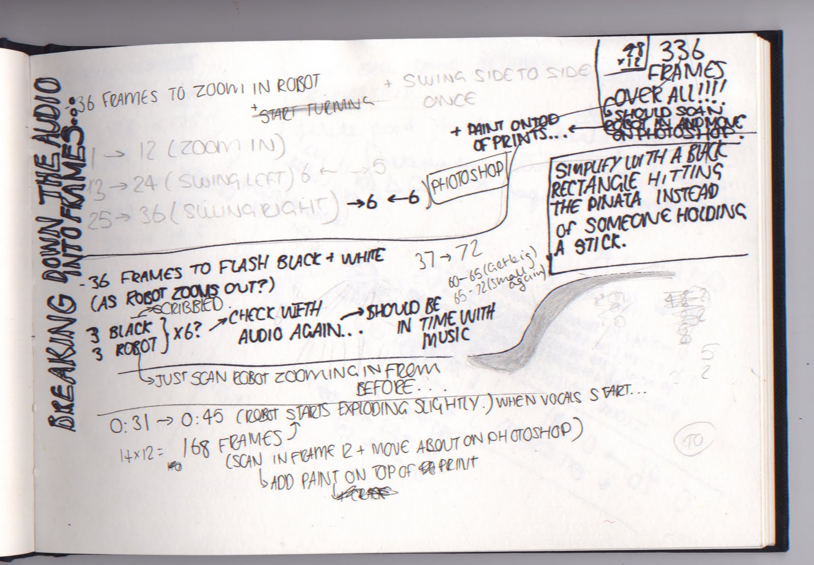

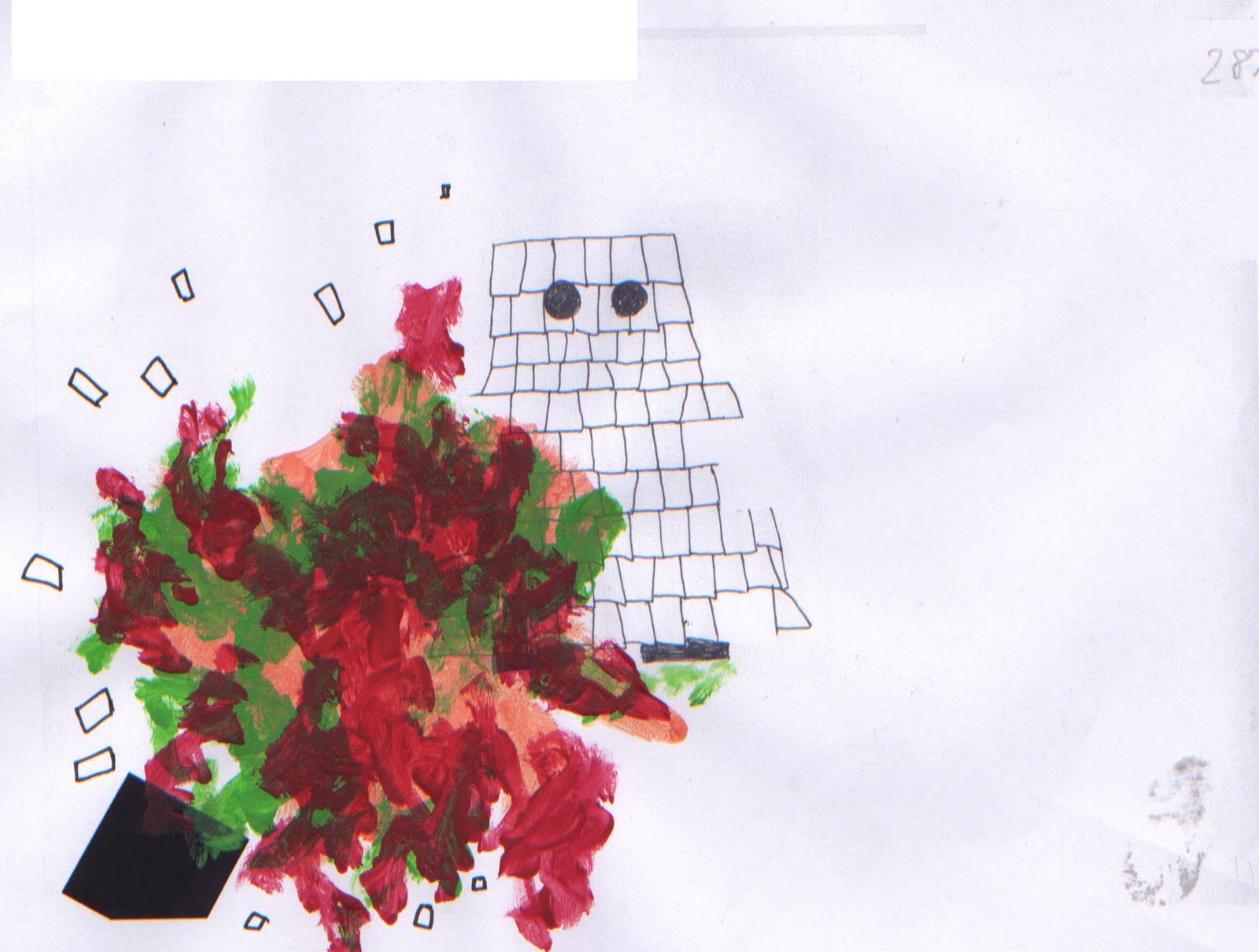
Throwing Squares
The colour explosions in my work are created by squares being thrown at the pinata. I used photoshop again to simply move and decrease the size of the square in each frame to suggest it moving towards the pinata. I also used photoshop to delete the sections of the pinata which had been destroyed by the squares at various points of my animation.


making the explosions
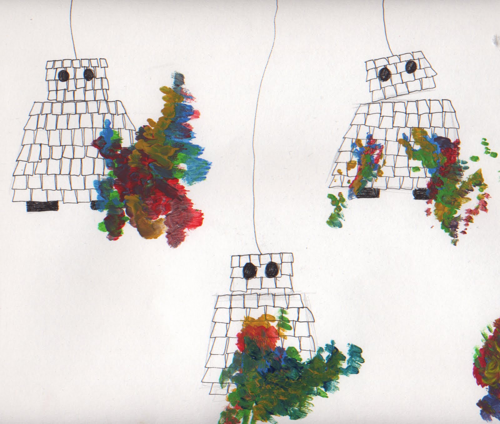
To create the explosion parts of my animation I printed each cell off and worked on top of it in acyrlic paint. Because of the nature of the explosions I enjoyed being able to work freehand and quite spontaneously.
After painting on top of my frames I scanned them in and added them to the sequence.


After painting on top of my frames I scanned them in and added them to the sequence.


Start of hand drawn animation.
To give my animation the hand-made aesthetic I wanted I began drawing each cell of my animation by hand. Although I like this effect I think that for the time scale I am working to it would be more suitable to work with my initial drawings in photoshop for the rest of the piece, but here are a few cells and a short tester clip.


Wednesday 4 May 2011
Colour Development
To create my colour explosions I have decided to use acrylic paint on top of my frames. Each frame will be painted differently which will show the motion of an explosion well, below are some developments of this style.

Monday 2 May 2011
Alex Box
Alex Box is a former fine artist who made the transition to make up artist, her fine art background is evident in her work. She sees make up as an art and uses the face as a canvas for her work.
I was introduced to her work after seeing this piece in 'dazed and confused' which she collaborated on with the photographer Rankin.
"I do it all freehand. The minute you start using stencils you've got a pre-conceived idea of what you're going to do." - Alex Box

I was introduced to her work after seeing this piece in 'dazed and confused' which she collaborated on with the photographer Rankin.
"I do it all freehand. The minute you start using stencils you've got a pre-conceived idea of what you're going to do." - Alex Box

This piece is very theatrical and the child-like painted face bears a resemblance to clown make up. This also the way box has used texture on the models face reminds me of the characters created by Alison Schulnik in her 'Ready Able' animation. The dark background and the expression of the model gives the piece a dark, sinister feel whilst still being child-like.
Jackson Pollock and Action Painting
Action Painting is a style associated with abstract expressionism and relies on spontaneity, the paint is dripped, poured and smeared across the canvas.
Pollock worked with liquid paint throughout his career experimenting with pouring and dripping methods. He saw his paintings as having a life of their own and I think this gives the effect of explosions in his work.
I was reminded of the link between Pollock's work and the effect I am trying to achieve in my animation on a recent trip to 'The Pompidou Centre' an art gallery in Paris after seeing 'The Deep' which Pollock painted in 1953.


John Squires artwork for The Stone Roses was obviously influenced greatly by Pollocks painting.

Sunday 1 May 2011
How to go about creating colour explosions.
'Aqua Artist' Mark Mawson creates these abstract works by simply dropping paint into water. The way that the paint spreads through the water creates a 3d tangible effect. To make different shapes Mawson uses paints with varying densities and the most common response to the subject of his work is sea creatures.


Friday 15 April 2011
more character development....


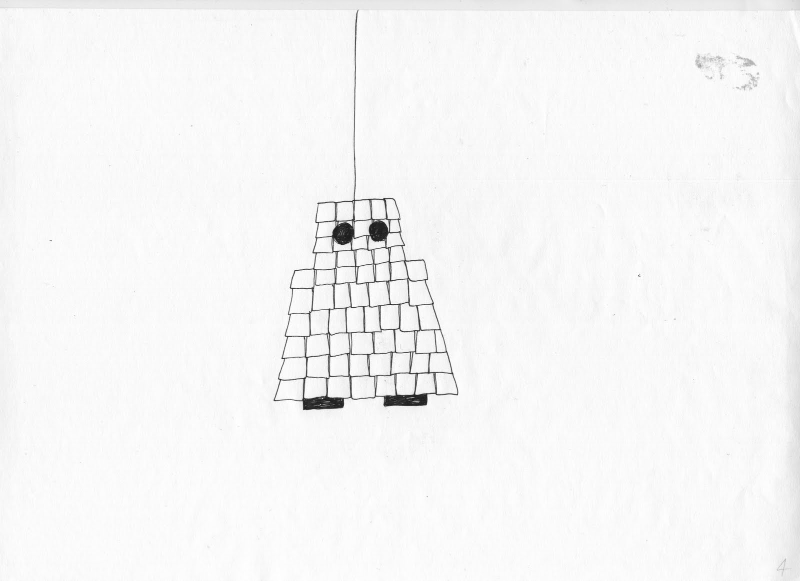
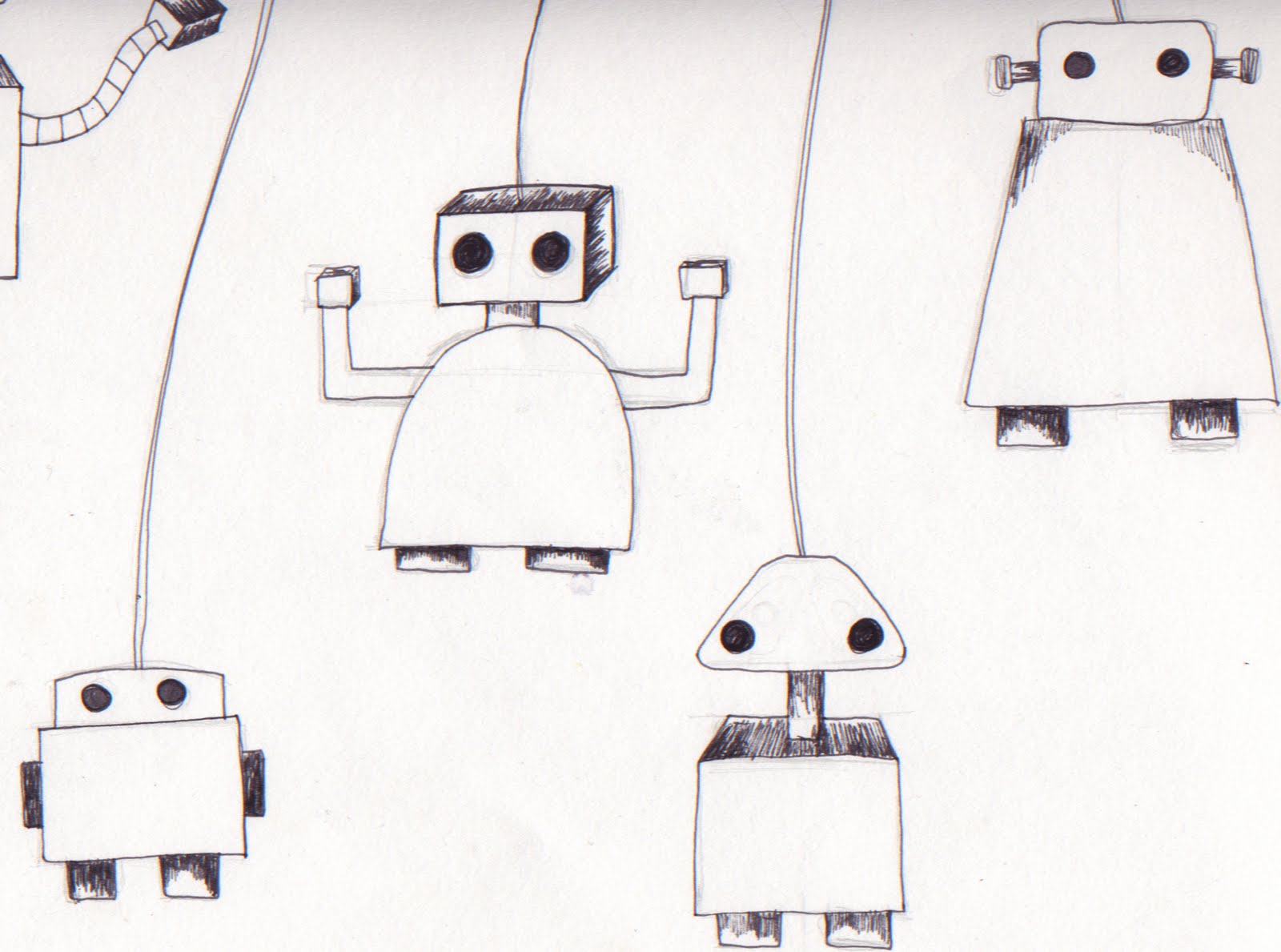
Because I want my character to be a pinata I need to simplify my design. After researching pinata's on the internet I've experimented with different ways of adding texture to my sketch using mark-making.
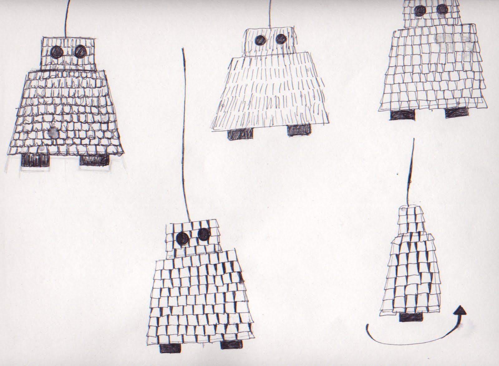
Character Development
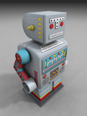
Now I have my narrative i've started designing characters for my animation. I looked at robots on the internet to get a brief idea of shapes and characteristics before creating several sketches of basic robots.


Tuesday 12 April 2011


cell animation workshop
I made this short 2 second, 12fps animation as part of an animation workshop. Working in a group of three we designed separate characters and made them interact through a simple narrative, below are some of my storyboard ideas followed by the final animation which we put together using after effects.


Monday 11 April 2011
Stop-motion workshop
I made this short animation during a workshop with a group of 3 other people. I enjoyed bringing the characters to life through stop-motion and a short narrative. I'd like to experiment more with this type of animation.
'Better Than Prince' Music Video
This music video for the band Flairs was created by video directors Jonas and Francois. The animation was created at 12 frames per second which along with the sketchy lines gives it a slightly 'jerky' home-made feel.
'She is the new thing' music video
This music video for the band 'The Horrors' first interested me because of the mix of photography and hand-drawn animation. The piece has a very surreal dark theme which fits in with the bands sound and aesthetic. I think the band members were shot in stop-motion then the illustrative parts added on top of each slide which is a technique I would like to experiment with. The explosions of blood also relate to the colour explosions I am intending to create in my animation.
Rayogram Workshop
I produced these prints during the rayogram workshop using string.
The string creates a very wire-like electronic effect which is a theme I have been working with in this project.

Although I found this technique interesting and effective I don't think it will suit my plan for my final piece of animation.
Pinata?
I've decided that my animation should link the two things I am reminded of when listening to the piece of music, robotics and carnivals.


To represent carnivals and celebration im going to use a pinata as my character and to bring in the theme of robotics i'm going to make the pinata in the shape of a robot. When the pinata is hit it is going to smash open releasing explosions of colour, probably in acrylic paint. Because I like the aesthetics of hand-drawn animation I'm hopefully going to use this style for my animation.
Thursday 7 April 2011
Alison Schulnik
'I like to see the material move and breathe and melt. I don't like things to stay static.' - Alison Schulnik
Alison Schulnik created this music video for the band 'Grizzly Bear' to accompany their song 'Ready Able'.
The animation has an abstract narrative focusing on one yeti-type character whilst he travels through a bizarre world encountering unsettling mutant creatures.
Schulnik has worked with clay to create a textured, melting effect suggesting mutation. The raw aesthetic of the piece has inspired me to experiment with texture using acrylic paints.
'It just felt right for the characters that they should not be so together. They're falling off their skeleton, they're falling off their own frame.' - Alison Schulnik
Monday 4 April 2011
Pes
I was shown this animation last year by a friend and have been interested in the work of Pes ever since.
Pes aka. Adam Pesapane creates stop-motion animations using every day objects and this is a classic example of his style, the ingredients for spaghetti bolognese being replaced with pin cushions, rubber bands, rubiks cubes and post-its etc to create a surreal effect.
'Clicking on a Pes film is to open a safe and suddenly see a million ideas glittering and exploding. The only reason you close the door is to reopen it just after and discover what will pop this time.' - Michel Gondry.
Michel Gondry
'I always hated pretentious commercials and videos before I started directing, not following the typical and saying that people are all fashion. It has always been my goal to make people feel alright when they watch my work.' - Michel Gondry
Michel Gondry has worked on commercials, music videos, shorts, feature films and other media. I was first introduced to his work from his music video for The White Stripes 'Fell in Love with a Girl'.
Gondry's use of lego bricks give the video a child-like aesthetic and also make it appear pixelated. Some parts of the animation look more 3-dimensional than others because of the way Gondry has used the lego bricks. The Red, Black and White colour scheme tie in with the trademark colours of the band and also suggests similarities to russian constructivism.
The video won Michel Gondry 'Breakthrough Video', 'Best Special Effects' and 'Best Editing' from MTV in 2002.
New Project - 'Print to Pixel'
I've been given a piece of music to select an extract from and interpret into a 30 second animation.
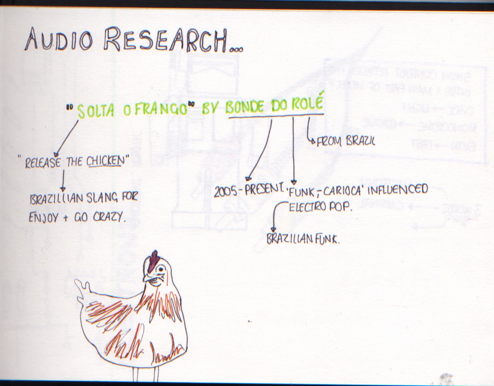
The piece is called 'Solta O Frango' by the brazilian band 'Bonde Do Role'
I had heard the piece of music before but to begin my research I listened to it on repeat to gather thoughts and ideas for a theme, here are a couple of pages from my sketchbook that I worked on whilst listening to the piece.

Tuesday 15 March 2011
Final Poster Design
This is my final poster design for 100 years of GF Smith Paper. I think the geometric element of the dominos along with the minimalistic futura typeface give the poster a very clean, modern aesthetic.
At first glance I'm not sure you can tell that the poster is made from paper but that will make people look closer and see the piece in more detail which was my aim.
I used blue paper for the background to create a link between my poster and 3d sculptural piece.
I considered grid structure when adding the text, lining it up with the first 0 which brings structure and balance to the poster. I also think the way I have used perspective contrasts well against the regular text.

Monday 14 March 2011
Ideas for layout...
Before adding the text to the poster on photoshop I've experimented with different layouts for the handmade aspect of my work before I take the final photograph.


I have decided to use this layout because I think it makes the '100' clearest to read. I think I will place the text underneath the two '0's' to balance the piece
Subscribe to:
Posts (Atom)